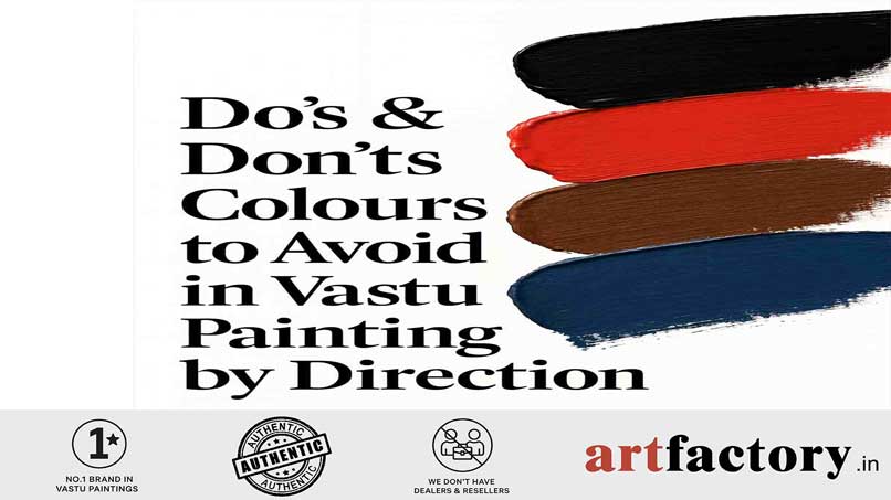
Do’s & Don’ts: Colours to Avoid in Vastu Painting by Direction
1. Which colours should be avoided in Vastu paintings for the East direction?
Avoid dark colours like black, grey, and deep red in the East. This direction represents growth and sunlight, making fresh greens and soft blues ideal.
2. What colours are bad for the South direction according to Vastu?
The South is a Fire element direction, so avoid blues and blacks, which clash with fire energy. Stick to reds, oranges, and terracotta tones.
3. Can we use black colour in Vastu paintings?
Use black sparingly and never in North or East directions. Black absorbs energy and may block financial or growth-related energy flow.
4. Which colours should not be used in the North direction?
Avoid red, maroon, and dark earthy tones in the North, as they suppress the Water element that governs abundance, opportunities, and career.
5. Is red colour bad for Vastu paintings?
Red is powerful but direction-sensitive. It is beneficial in the South but should never be used excessively in North or East areas.
6. Should we avoid grey colours in Vastu?
Avoid grey in East and Northeast, where clarity and positivity are needed. Grey can dull energy and create mental fog.
7. Are pastels safe for all directions?
Yes, soft pastels are universally safe because they maintain balance and subtlety without dominating elemental energies.
8. What colors create negative energy in Vastu?
Excessive black, dark brown, dull grey, and muddy tones may create heaviness, stagnation, and emotional imbalance.
9. Do wrong colors in Vastu paintings affect mood and energy?
Yes. Colours influence mental, emotional, and environmental vibration, and mismatched colours with directions can weaken harmony.
10. How do I pick the right Vastu painting colour for my home?
Match each direction with its Vastu element and avoid clashing colours. Choose themes, subjects, and tones that support growth, peace, and success.
Introduction: Understanding Vastu Colours & the “Don’ts” by Direction
In Vastu Shastra, colours hold immense power. They are not just visual elements but energy conductors that influence mood, prosperity, creativity, and mental well-being. When used correctly—especially in Vastu paintings placed in specific directions—colours can enhance harmony, clarity, and balance. But when used incorrectly, they can block opportunities, disturb emotional stability, and reduce the positive energy of a space.
This blog covers the most essential Do’s and Don’ts, especially colours to avoid in Vastu paintings by direction, helping you create a home aligned with natural forces, five elements, and cosmic energy flow.
Why Colour Choice Matters in Vastu Paintings
Vastu paintings are more than decorative pieces—they act as energy amplifiers. Each direction in Vastu represents a specific element and vibration. Using a colour that clashes with that natural element can create imbalance.
For example:
Using red (Fire) in the North (Water) direction creates elemental conflict.
Using black in the East, the direction of sunlight and growth, blocks the flow of new beginnings.
By understanding the science of colour psychology + Vastu energy alignment, you gain the clarity to select paintings that support success, peace, and abundance.
Directional Vastu Guide: Colours to Avoid in Vastu Paintings
Below is a complete breakdown of what NOT to use, and why.
1. East Direction (Element: Air + Rising Sun)
Vastu Theme: Growth, health, new beginnings, harmony
Best Colours: Green, light blue, sunrise tones, soft yellows
❌ Colours to Avoid in East:
Black → blocks growth, absorbs sunlight
Grey → reduces vitality, dulls motivation
Dark red or maroon → too aggressive for gentle Air element
Dark brown → heavy and grounding, unsuitable for uplift energy
Why to Avoid:
The East is the direction of life-force (Prana). Heavy or dark colours restrict this upward-moving energy. Paintings here should feel fresh, light, and open.
2. West Direction (Element: Space/Water blend)
Vastu Theme: Stability, gains, fulfillment
Best Colours: White, silver, soft blue, pastel shades
❌ Colours to Avoid in West:
Fiery reds and oranges → conflict with cooling energies
Very dark browns → stagnancy
Bright yellow → too stimulating
Why to Avoid:
The West direction supports achievement and consistent progress. Overly stimulating colours disturb this calming atmosphere.
3. North Direction (Element: Water)
Vastu Theme: Money flow, career opportunities, growth in profession
Best Colours: Blue, aqua, silver, soft white
❌ Colours to Avoid in North:
Red and maroon → Fire clashes with Water
Dark brown → blocks financial movement
Gold-heavy tones → overpower subtle water energy
Orange → overstimulates the space
Why to Avoid:
To attract abundance, the North should remain cool, flowing, and uncluttered. Warm fiery tones slow down financial momentum.
4. South Direction (Element: Fire)
Vastu Theme: Confidence, fame, recognition, ambition
Best Colours: Red, orange, coral, gold, pink, fiery tones
❌ Colours to Avoid in South:
Black and dark blue → Water element extinguishes Fire
Grey → dulls ambition
Green → Air weakens Fire
Why to Avoid:
Fire thrives on warmth and vibrancy. Dark or cool colours create friction and energy reduction, affecting motivation and success.
5. Northeast Direction (Element: Water + Spirituality)
Vastu Theme: Clarity, spirituality, peace, wisdom
Best Colours: Light blue, white, pastels, soft yellows
❌ Colours to Avoid in Northeast:
Black → absorbs spiritual vibration
Red or orange → too aggressive
Brown → heavy and grounding, blocks intuition
Grey → reduces mental clarity
Why to Avoid:
Northeast is the “Ishan” corner, the most sacred zone. Aggressive or dull colours disturb meditation, clarity, and insight.
6. Southeast Direction (Element: Fire)
Vastu Theme: Finances, energy, passion, business success
Best Colours: Red, orange, pink, copper, peach
❌ Colours to Avoid in Southeast:
Blue → drains Fire
Black → suppresses financial strength
Aqua/teal → water-element shades weaken fire power
Why to Avoid:
The Southeast fuels financial energy and vitality. Water tones disrupt the natural fire-based vibration of this area.
7. Northwest Direction (Element: Air)
Vastu Theme: Relationships, support systems, communication
Best Colours: White, cream, silver, pastel blue
❌ Colours to Avoid in Northwest:
Black → restricts movement
Very bright red/orange → creates conflict in relationships
Dark earthy shades → suppress openness
8. Southwest Direction (Element: Earth)
Vastu Theme: Strength, stability, family bonds, leadership
Best Colours: Beige, earthy browns, mustard, peach, terracotta
❌ Colours to Avoid in Southwest:
Blue → Water destabilizes Earth
Black → too heavy
Bright red → overstimulating
Green → Air element weakens Earth
How Colour Energy Works in Vastu Paintings
1. Elemental Alignment
Each direction correlates with an element (Earth, Fire, Water, Air, Space). Colours act like “frequency matches.” When frequencies clash, energy blocks occur.
2. Psychological Influence
Colours influence:
Mood
Motivation
Creativity
Sleep
Emotional balance
3. Visual Vibration
Paintings radiate continuous visual cues. Wrong colours send conflicting signals to the subconscious mind.
4. Home Energy Flow (Prana Movement)
When colours support directional elements, energy flows freely, enhancing well-being and prosperity.
Benefits of Choosing Correct Vastu Colours in Paintings
Enhances positive energy in the home
Supports mental clarity & emotional balance
Attracts abundance, opportunities, and success
Improves relationships and communication
Boosts creativity and productivity
Aligns home visuals with cosmic and elemental harmony
Do’s & Don’ts for Vastu Painting Colours (Quick Checklist)
Do’s
✔️ Match colours with the direction’s element
✔️ Use soft, uplifting, natural tones
✔️ Prioritize subject + colour harmony
✔️ Keep the artwork clean and uncluttered
✔️ Use pastels if confused—they are universally safe
✔️ Regularly dust and maintain artwork
Don’ts
❌ Don’t use colours that clash with the direction’s element
❌ Don’t place paintings with overly dark or depressing colours
❌ Don’t mix too many bold colours in one frame
❌ Never place aggressive, chaotic colours in the Northeast
❌ Avoid black-heavy paintings in East or North zones
Step-by-Step Guide: How to Choose the Right Vastu Painting (Without Mistakes)
Step 1: Identify the Correct Direction
Stand facing the main door and map your layout using a compass.
Step 2: Understand the Element of That Direction
(East = Air, North = Water, etc.)
Step 3: Shortlist Paintings Based on Themes
Examples:
East → greenery, sunrise, fresh leaves
North → flowing water, blue koi fish
South → fiery mountains, red abstract art
Step 4: Review Colour Palette
Ensure no restricted colours appear prominently.
Step 5: Maintain Balance
A dominant colour should align with Vastu principles; supporting colours should be neutral.
Step 6: Test Emotional Response
Ask yourself how the painting makes you feel. Calm and uplifting is ideal.
Step 7: Place with Intention
Correct height, clean walls, good lighting.
Common Mistakes to Avoid in Vastu Painting Colours
Choosing artwork for style instead of energy
Using oversized, dark-toned paintings in small rooms
Mixing themes that contradict Vastu (e.g., fire + water)
Using too many modern abstract designs with chaotic patterns
Ignoring natural light and room purpose
Forgetting that frames also influence energy—avoid black frames in East/North
Expert Suggestions for Best Vastu Colour Practice
Use one dominant element theme per wall
If unsure, choose white or pastel backgrounds
Earthy colours in Southwest help strengthen family stability
Choose ocean or river themes only in North/Northeast, not South
Use golden accents sparingly—they energize but can overpower
Ensure every painting reflects positivity, movement, hope, or growth
Conclusion
Colours are powerful tools in Vastu Shastra. The right colour in the right direction amplifies positivity, prosperity, mental balance, and harmony—while the wrong colour can create subtle blocks in energy flow. By understanding which colours to avoid in Vastu paintings by direction, you make intentional choices that transform your space into a sanctuary of balance, growth, and success.
With this guide, you can now confidently select artworks that support the natural energy of each direction, helping your home radiate positivity and purpose.
If you'd like, I can also create Vastu-based painting prompts, direction-wise décor guides, or room-by-room Vastu colour charts.
Comments : (0)